What if you could create a visual language around the values of the brand?
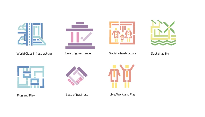
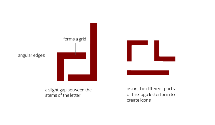
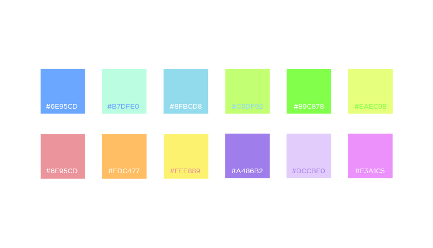
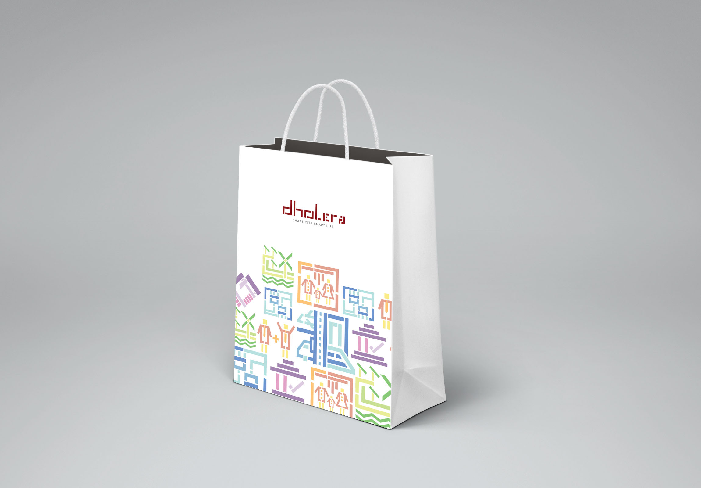
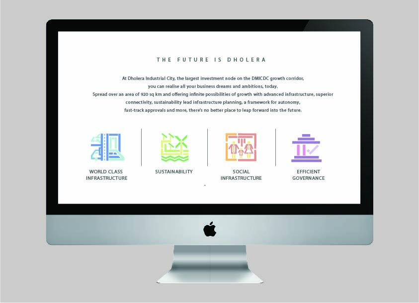
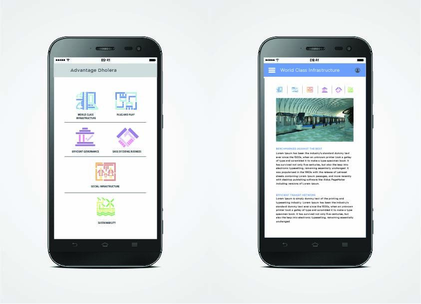
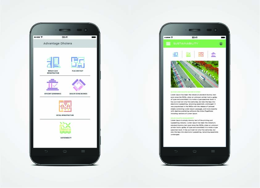
This project done during my time at Vyas Giannetti Creative, for the place branding of an upcoming smart city in India called Dholera. The logo form was something that had already been decided and we have room to play around with the brand language. We studied the manifesto and looked at the seven pillars of Dholera - i.e. the founding principles of the smart city. We created a language and colour palette that could be extended into various collaterals and was more than just aesthetically pleasing.
This project was done under the mentorship of Preeti Vyas and Chittaranjan Gnanadason at VGC.
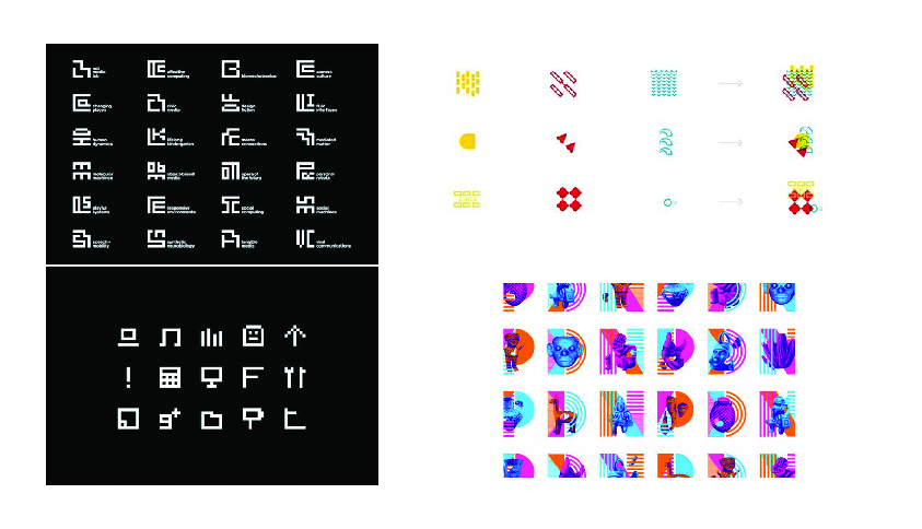
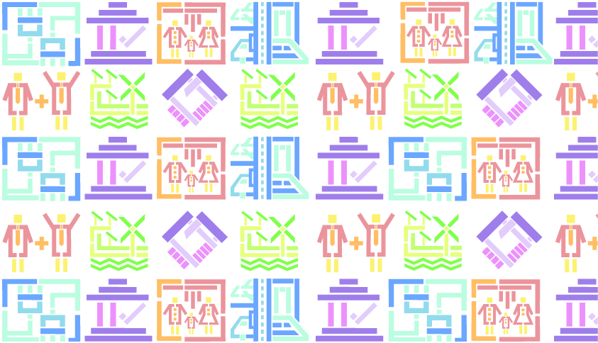
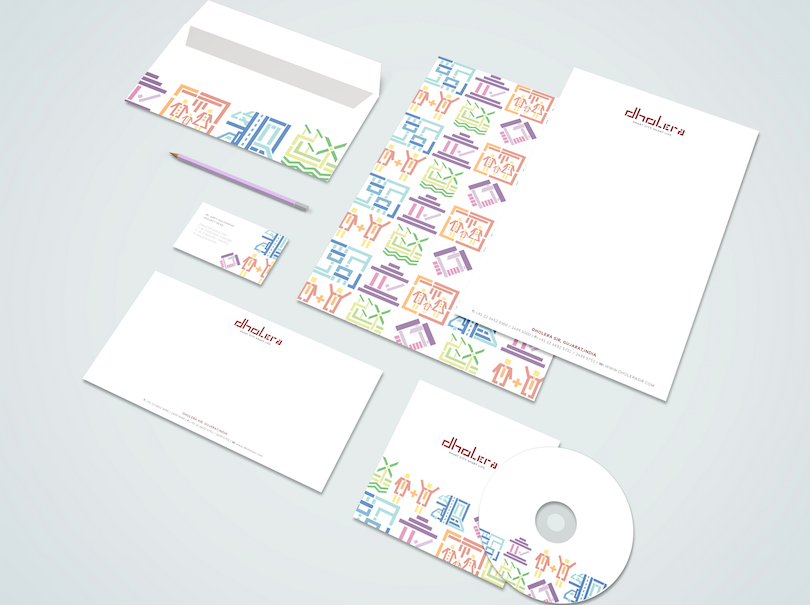
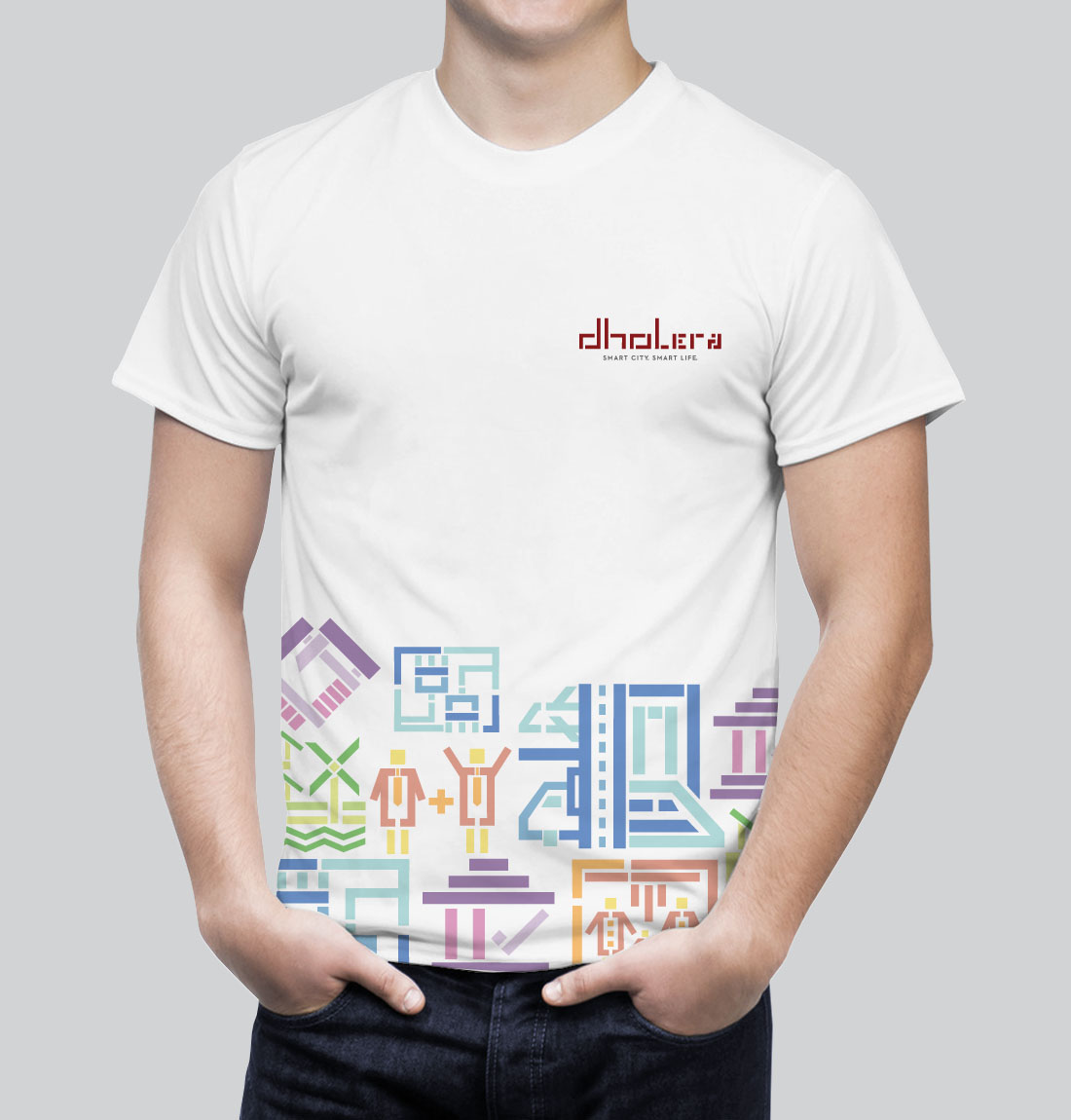
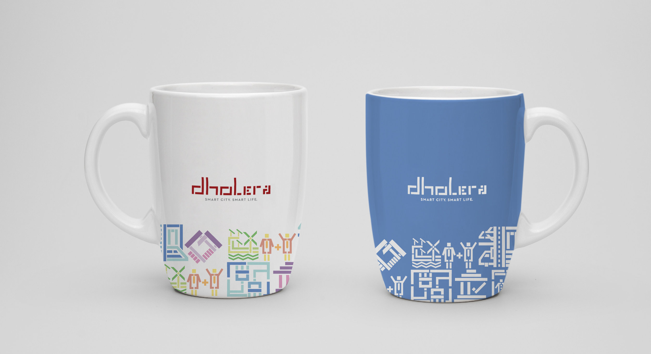
The collaterals developed were based on this visual language, using the icons developed for the brand.

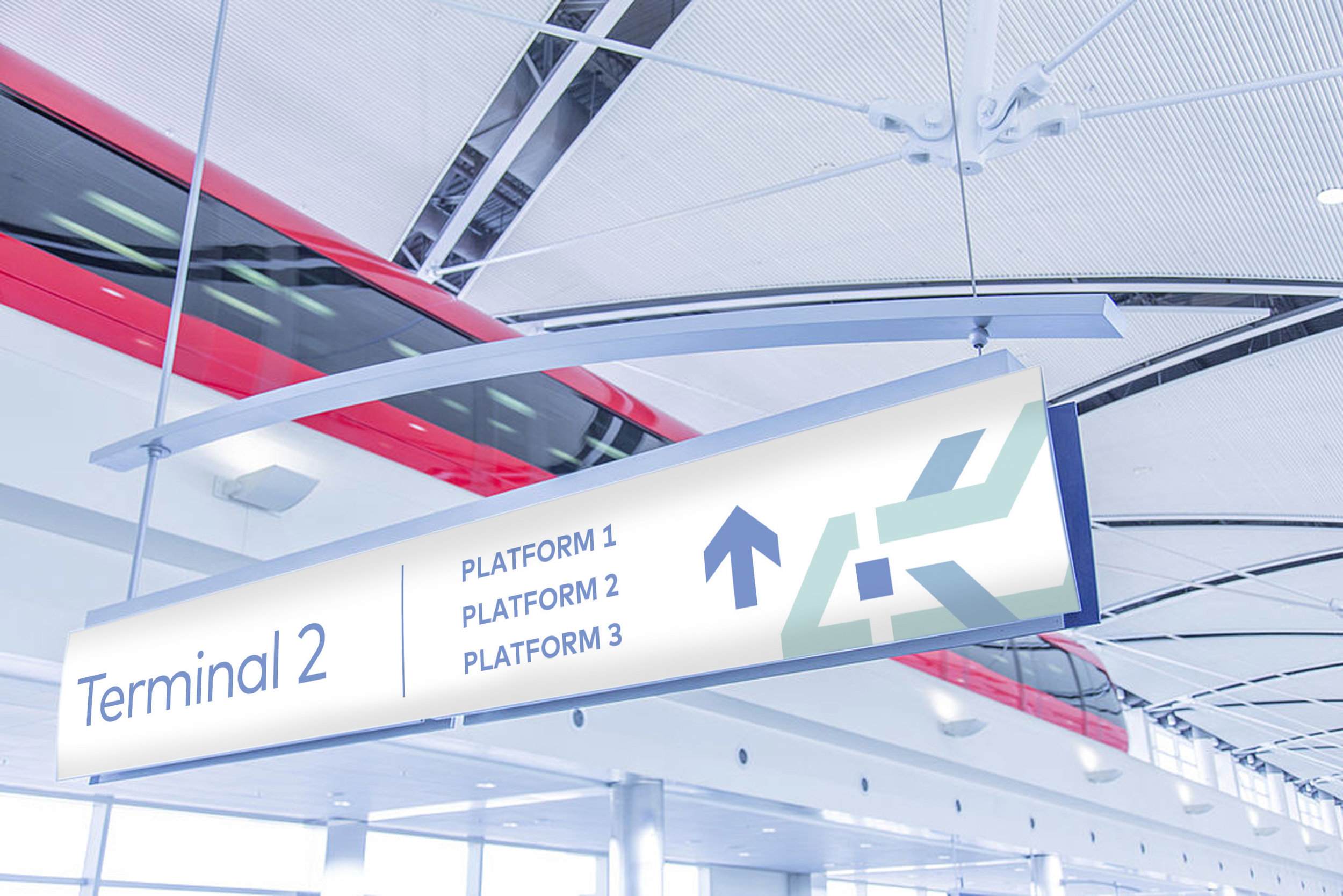
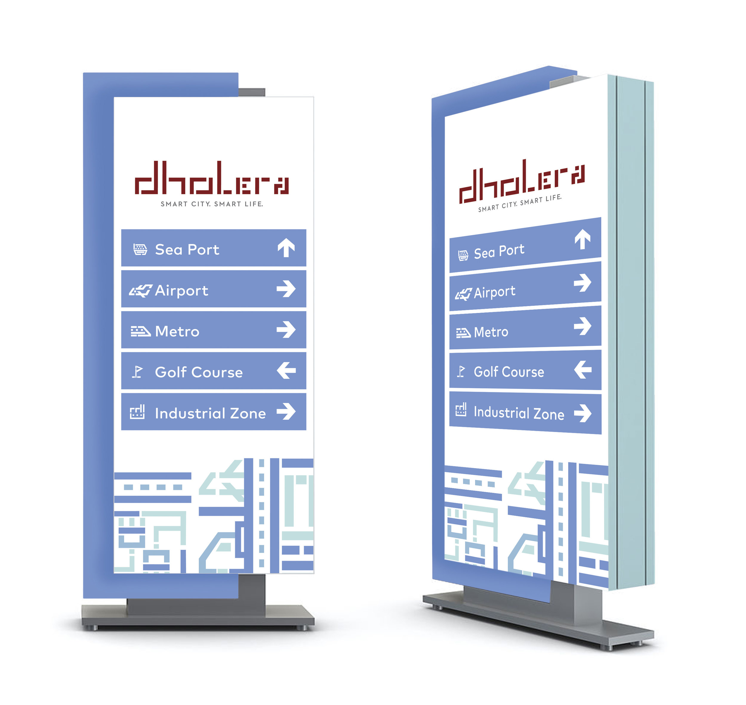
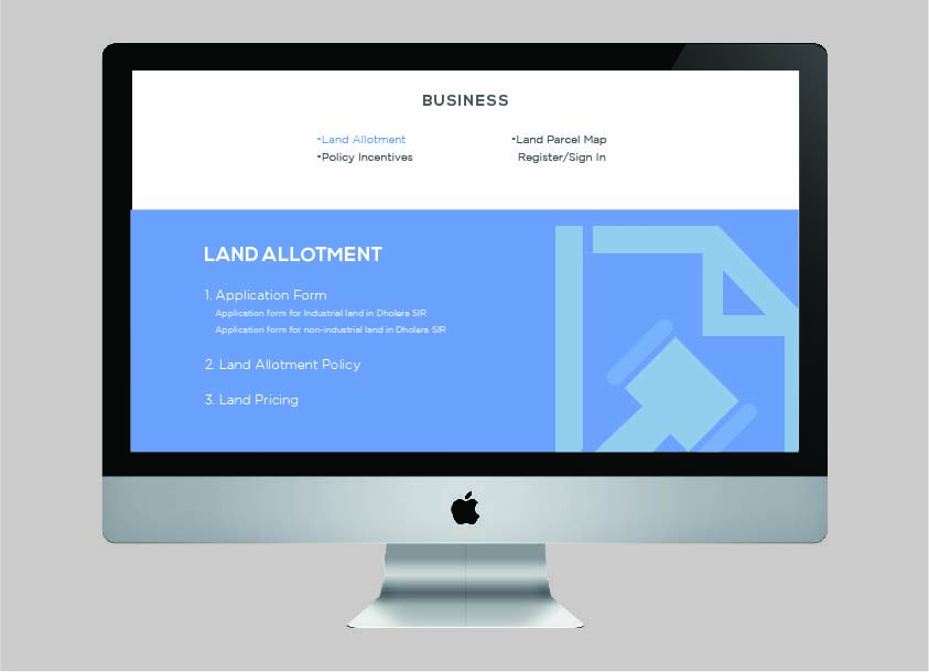
We also looked into how the language extends to city signage and web collaterals.

The main challenge of this project was to work with an organisation affiliated to the government and help them adopt an entirely non conventional perspective of place branding that would challenge the existing notion that the target audience - in this case investors and entrepreneurs could engage and associate with.
© 2018 Pallavi Datta